

IXL is an education program that is mainly used by schools to help supplement a students in class lessons to continue their learning. While going through a couple lessons we found that IXL's lessons lacked engagement for elementary school aged children. Because of this we decided to spruce things up a little bit by making it more engaging and provide incentives that encourage students to continue doing lessons.
But lets rewind a bit..
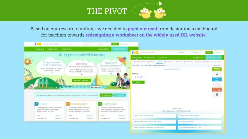
We didn't originally start with a redesign of IXL. We initially started with the idea that we could create a one stop shop for teachers to have fun digital worksheets and online learning programs in one place. This idea came because of the COVID-19 pandemic and educators were rarely allowed to hand out physical worksheets for students to work on and instead had to resort to digital devices to help students with their learning. As we were researching all the programs available we got a little overwhelmed at the robust information that was available for supplemental learning.
USER RESEARCH
With the completion of a competitor analysis; determining the pros, cons, strengths and weaknesses, we concluded that all the programs analyzed could be broken into two groups; more game focused with not enough educational focus and more education focus with not enough user engagement. There wasn't a lot of middle ground to help engage users in a fun or exciting way while also giving them educational content. Continuing our research we moved ahead creating Proto Persona's* to fuel our user interviews and building out an interview plan.
*Proto Persona's are fictional representations of who we believe will be using the product(s) we are designing.


DEFINITION AND IDEATION
After defining our Persona we decided to do a heuristic evaluation of the IXL website to detect usability issues that are occurring when users are interacting with the website and identify ways to solve them. We had already received feedback from users during interviews who have used the program but this gave us a different way of looking for things that may have been missed when the user was engaging the site.


Recreating features within the lessons to allow users multiple chances to complete the questions and receive feedback when they missed the question. Our journey map shows how a user could feel when going through the process of using IXL with these changes. Also adding in positive reinforcement allows users to feel more accomplished and have a positive response when using the program.
PROTOTYPING
Knowing what features we needed and how we wanted the new flow to go for users, we transitioned into building the flow out. We decided to keep the IXL colors that have already been established within the brand, the are colorful, fun, and appealing to consumers. To help with appeal we created Freddie the Bear to be a helping hand and Silly Canary stickers as rewards for completed tasks.

The layout consists of three columns to allow focus to be in the center but also allow for other information to be present in a simplistic look and feel. A status bar on the right shows users where they are at in their lessons, the bar on the left shows which user is logged in, their score, and Freddie the Bear where they can click for any help they may need to answer. The middle is the largest portion because it is the main focal point, where the users will be doing their lessons. We wanted to keep things clean and clear so there wasn't confusion on what was expected of them.

As was shown in the user flow we chose to give the user three tries before we would show them how to correctly answer the question and move on in the flow. In each of the failed states the user will be given hints, or rather the steps to solve the problem, giving small encouraging messages while they work to complete the lessons. No matter where they are in the lesson they can click Freddie and get an example of what is being asked to solve. It was crucial to make the experience visually appealing to children, while maintaining the effectiveness of an online worksheet.

Testing and Iteration
After building out our prototype we created a testing plan to get user input about any changes we might need. We tested nine students, a teacher, and a few peers.
Testing Objectives
We specifically want to know...
- Can they easily go through the questions?
- How do they feel throughout the process?
- Do they notice the reward system?
Tasks for the user to complete
- Log into IXL and begin the teacher-recommended lesson.
- Click through and read thoroughly the 6 questions.
Test Scenario
Our user is a third grade student that uses technology in the classroom on a regular basis.
Assumptions
- Participants are comfortable using laptops/desktop.
- Participants have internet access.
- Participants are elementary school students.
We received some useful feedback from our usability testing that led us to make some iterations to our original designs and keep other features.


Hi-Fidelity Prototype
With testing complete, we moved into polishing up a high-fidelity prototype for desktop and tablet that would be ready for coding. We opted for a tablet and desktop version, not including mobile because most users are students who access the program at school either on tablets or a computer of some sort. A mobile version would be something to assess the benefits for a future feature.
To try out this tablet hi-fidelity prototype in Figma click here.
Kids can easily get distracted from their lessons, we wanted to help make sure they kept their focus as well as felt encouraged and supported throughout the process of completing the lesson whether they knew what they were doing or still learning. The lesson is direct and an explanation is provided at the start of the lesson preparing the user for what they will be learning. The user is supported throughout and receives rewards for their work. Along with the progress tracker the user will also get a "Halfway There" encouragement to help break things up and motivate the user to continue working towards the goal of receiving a Silly Canary sticker.

Front-end Development
To begin coding, we paired down the flow from a full lesson down to its core “success” and “fail” states, since these interactions were most important to engaging our users & motivating them to continue. Our goal by doing some initial front-end development was to show the feasibility of the project and see how the experience would feel in a native browser or tablet. Here you can see how our code shaped out. In just a few short days, were able to get it pretty close to the original mock-up, and showcased how the experience would be within in a browser setting. We used GitHub to work remotely together while we developed the website and host it for review.

We learned a lot in the process, from some hard changes and baffling research results, we were able to turn out a viable product that we are very proud of! In the future if we were to continue with this project, we would definitely focus on coding in the responsive breakpoints and perhaps contact the stakeholders for input. We would also continue to mock-up a results dashboard for the students to see their overall grade level progress.